Spyderserve Web Development

Designing For All Devices: Crucial for User Experience, Your Business
Dylan Caldwell - May 10, 2023
Updated on 11/2/2023
In the U.S., over 90% of people have access to the internet. Many of those people also use a highly capable device that has no problem rendering complex websites. With so much computing power, many developers may forget to design websites that are accessible to a large range of users on different devices. When developing a website, it’s important to make sure that users get the same experience on different devices, browsers and internet speeds. To do this, there are many tricks that can be used like loading different assets in the background, rendering complex graphics on the server and much more. Even as smartphones and computers continue to grow more powerful, it’s crucial that websites are made to support a large range of mobile devices.
1. Identify What Users are Looking For
Websites have a reason for existing. Some websites are created for getting a businesses information online and others are meant for users to easily place orders. Medium.com recommends asking yourself a question: “What are the most common and important tasks that customers need to complete?” Designing for these specific tasks will allow for a positive experience for users and allow for a higher return on investment, or ROI.
2. Provide a Consistent Experience
Consistency is key for user experience. According to Zippia, 81% of shoppers choose to research a business online before making a purchase. Websites are a first impression to a customer, so it is important to provide a consistent experience when users view the desktop, laptop or mobile versions of a website. With WordPress, Spyderserve is able to test designs for desktop, laptops and mobile devices so we can ensure users receive optimal results when visiting your business online.
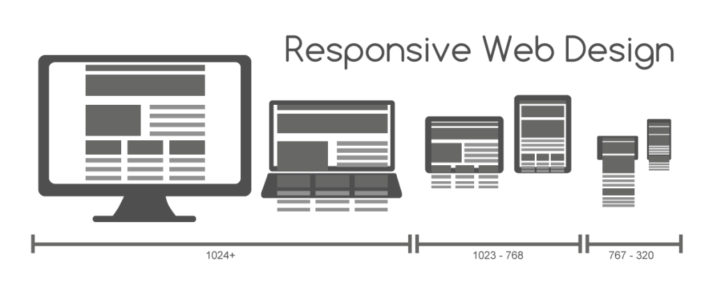
Here is an image of the different screen sizes that need to be considered when designing a website:
3. Identify Device Groups of Users
While it is important to ensure a website is designed for a variety of screen sizes (desktop, laptop, cell phone and the various sizes of each of those items), it’s important to put thought and time into designing for each screen.
4. Test Your Design
Testing the design is an important step in the Spyderserve process. We review the different design sizes during each stage of development to make sure it is up to par with our standards. Our clients will also have a chance to review these designs to ensure they are getting what they envisioned for their website. This step is crucial in our process as it allows us to review and see any loose ends that may need to be tightened up before the launch of your website.
About Spyderserve
Spyderserve is a full-service website development company based in Valdosta, Georgia specializing in designing, building, and supporting websites and web applications with search engine optimization (SEO), accessibility, and usability in mind. Contact us today at (229) 269-4108 to find out more about how we can get your business online!